

SearchBar
A beautifully-designed, accessible search component for React
1. Installation
npm install @upstash/search-ui// 👇 import package and optimized stylesimport { SearchBar } from "@upstash/search-ui"import "@upstash/search-ui/dist/index.css"2. Code Example
Our search component is designed to be provider agnostic.
In the code below we're using Upstash Search - our solution for fast, reliable and highly scalable serverless search.
Creating a search database takes less than a minute: get started here. To follow along with Upstash Search, install the package:
npm install @upstash/search"use client"import { SearchBar } from "@upstash/search-ui"import "@upstash/search-ui/dist/index.css"import { Search } from "@upstash/search"import { FileText } from "lucide-react"const client = new Search({ url: "<UPSTASH_SEARCH_URL>", token: "<YOUR_SEARCH_READONLY_TOKEN>",})// 👇 your search index nameconst index = client.index<{ title: string }>("movies")export default function Page() { return ( <div className="max-w-sm mt-24 mx-auto"> <SearchBar.Dialog> <SearchBar.DialogTrigger placeholder="Search movies..." /> <SearchBar.DialogContent> <SearchBar.Input placeholder="Type to search movies..." /> <SearchBar.Results searchFn={(query) => { // 👇 100% type-safe: whatever you return here is // automatically typed as `result` below return index.search({ query, limit: 10, reranking: true }) }} > {(result) => ( <SearchBar.Result value={result.id} key={result.id}> <SearchBar.ResultIcon> <FileText className="text-gray-600" /> </SearchBar.ResultIcon> <SearchBar.ResultContent> <SearchBar.ResultTitle> {result.content.title} </SearchBar.ResultTitle> <p className="text-xs text-gray-500 mt-0.5">Movie</p> </SearchBar.ResultContent> </SearchBar.Result> )} </SearchBar.Results> </SearchBar.DialogContent> </SearchBar.Dialog> </div> )}Using a Readonly Token (recommended)
The token used in the Search client above is a read-only token.
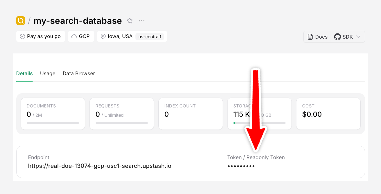
This token is safe to expose on the frontend. This allows your application to perform search queries without the need for a backend API.
To use environment variables for the token, set it as NEXT_PUBLIC_YOUR_READONLY_TOKEN in your .env file.
Optionally, you can also create a separate backend API to handle search on the server.
Handling Results
You can perform actions with the search results by using the onSelect prop on SearchBar.Item:
<SearchBar.Result onSelect={() => { // 👇 do something with result console.log(result) }} value={result.id} key={result.id}>Customization
This component is beautifully pre-styled, but 100% customizable. You can change every piece of it yourself by passing normal React props to each component (such as className).
For example: If you wanted to change the primary color, change the CSS classes:
<SearchBar.Input className="focus:ring-red-500" placeholder="Type to search movies..."/><SearchBar.ResultTitle className="font-medium text-gray-900" highlightClassName="decoration-red-500 text-red-500"> {result.content.title}</SearchBar.ResultTitle>This component is based on the Radix UI Dialog Primitive and Paco Coursey's cmdk library.